Creating Hierarchy with Positioning
Spacing, Grid, and Layout define how we arrange elements on the page in a way that is easy to understand, is representative of the hierarchy of the information, and has a consistent rhythm.
Nuggets of Knowledge
- Use the spacing variables prescribed in the design system. There are always exceptions to the rule, but modifications should be avoided if at all possible. Remember that modifying the grid settings can have a compounding mathematical effect that can cause a cascading set of failures across the design system.
- Containers on your page should be aligned to the CBP Layout Grid except in very specific circumstances (described in this guide).
- Elements on the page should be aligned to the layout grid, does not mean that their dimensions must be defined by it.
- The minimum space between separate containers on the page is $spacing-regular (20px), except when crossing columns, in which case the gutter will define that spacing.
- You should test your layouts against each of the 4 main break points and prescribe changes in layout to match each if necessary.
- CBP Applications and sites are responsive. Functionality that is accessible on the desktop should also be available on other devices accessing the service.
- Do not adjust the CBP Layout Grid settings, including most notably gutter and margin sizing.
- The body element in your HTML file should have the class .cbp-layout-grid applied.
- Please only use the spacing variables prescribed in the design system. There are always exceptions to the rule, but this should be avoided if at all possible.
- Containers on your page should be aligned to the CBP Layout Grid except in very narrow circumstances (described in this guide).
- Just because elements on the page should be aligned to the layout grid does not mean that their dimensions must be defined by it too.
- The minimum space between separate containers on the page is $spacing-regular (20px), except when crossing columns in which case the gutter will define that spacing.
- You should test your layouts against each of the 4 main break points and prescribe changes in layout to match each if necessary.
- CBP Applications and sites are responsive. Functionality that is accessible on the desktop should also be available on other devices accessing the service.
- Do not adjust the CBP Layout Grid settings, including most notably gutter and margin sizing.
The Layout Grid
The word grid is a bit overused when it comes to development. In this specific instance the "Layout Grid" we are referring to is the skeleton on which different elements are placed to give the overall page structure. It's made up of 3 main parts: Columns, Gutters, and Margins. The CBP Design System supports 4 major breakpoints: small, medium, large, and extra-large. Major breakpoints are the viewport width points that are aligned to the most common device resolutions (logical resolution not device screen resolution). From one breakpoint to another the grid may change the number of columns or the values associated with gutter or margin width. From a horizontal alignment perspective, your content should align to this grid. An exception to this may include fluid dashboards where dividing up the page via percentages is more effective. Regardless of which method is used, the grid margin must be preserved. In general, you will notice that the size of the gutters and margins stays static while the columns grow and shrink to fit the remainder of the viewport width at each major breakpoint.
NOTE: At a later point native mobile versions of the CBP Design System will swap these pixel values for that ecosystem's particular unit of measurement. For iOS this means pt(s) and for Android, dp(s).
Major Breakpoints
Small Break Point <599px 4 column 20px margin / 16px gutter
This will cover the gamut of mobile devices currently in the wild. Margins are slightly larger than the gutters. The vast majority of layout containers at this breakpoint will be 4 columns wide and effectively be a single column layout. It should be clear that multiple columns of text are unacceptable at this breakpoint to keep legibility in mind. Learn more about major breakpoints here.

Medium Break Point 600-1023px 8 column 32px margin / 28px gutter
This will encapsulate most of the large mobile form factors through most vertical tablet range of viewports, stopping just shy of the default px width of most small laptops. The gutters are sized to allow multiple columns of text (2rem), but the 45-75 character range for line length should be maintained for long blocks of text. Learn more about major breakpoints here.

Large Break Point 1024-1439px 12 column 32px margin / 28px gutter
This will cover our landscape orientation on tablets as well as a range of small laptop and desktop viewports. Learn more about major breakpoints here.

Extra Large Break Point <1440px 12 column 44px margins / 28px gutter
This will cover the range of desktops and displays on the larger end of the spectrum. Learn more about major breakpoints here.

Spacing System
When prescribing the space between containers, or elements within containers, you should use the following spacing classes. All classes are based on the 4px baseline grid. You should not need to create custom classes. These spacing classes can be used directly on properties like padding and margin to help define spatial relationships. Keep in mind which classes you choose will inform users to what information is related to another element. The smaller the space, the more closely related it is. Classes are not responsive, meaning they do not automatically change from one major breakpoint to another. You should test your layouts at each major breakpoint to see if one variable should be substituted at one breakpoint for another.
NOTE: At a later point native mobile versions of the CBP Design System will swap these pixel values for that ecosystem's particular unit of measurement. For iOS this means pt(s) and for Android, dp(s).
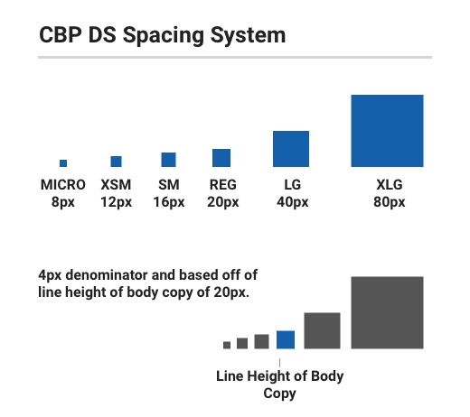
$cbp-spacing-micro: 8px
$cbp-spacing-xsmall: 12px
$cbp-spacing-small: 16px
$cbp-spacing-regular: 20px
$cbp-spacing-large: 40px
$cbp-spacing-xlarge: 80px
Spacing Component Classes
In order to speed up development time, the CBP Design System utilizes classes that allow you to quickly apply spacing to elements that align to the main spacing philosophies. There are basically 5 main spacing philosophies:
- Square Inset
- Squish Inset
- Stretch Inset
- Stack
- Inline
Square Inset (Relationship of parent container to contained child elements)
This spacing style applies a constant px value around the interior of the component container to align elements to. These classes apply spacing variables evenly to the padding property.
Squish Inset (relationship of parent container to contained child elements)
This style allows for asymmetrical spacing with the vertical spacing being smaller than the horizontal spacing. In these classes we apply a spacing variable to top and bottom padding, then assign the next variable up to the left and right padding.
Stretch Inset (relationship of parent container to contained child elements)
Similar to squish inset, except it is the converse of the concept, in this instance the vertical value is greater than the horizontal. In these classes we apply a spacing variable to the left and right padding, then apply the next level up to the top and bottom padding.
Stack (vertical relationship between individual elements within a contain or between containers)
The stack philosophy defines the vertical spacing values associated between elements or between containers themselves. It does not affect spacing on the horizontal axis. These classes only apply padding to the bottom of the element or container.
Inline (horizontal relationship between individual elements)
Inline is similar to stack except on the horizontal axis. This is an important concept for understanding responsive design, as this assigned or minimum space will dictate when elements will wrap or reflow. These classes apply padding only on the right. THIS DOES NOT REPLACE THE GUTTER. When spacing containers on the horizontal axis you should use the layout grid, not inline spacing to separate them.