Introduction
Digital products are primarily focused on communication, but they also expect their users to do something with this information. At CBP, our products enable legitimate trade and travel by presenting our officers with information, and then allowing them to make a decision on whether that person or thing has a legitimate reason for entering or exiting our borders.
Nuggets of Knowledge
- Do not hide information or functionality behind a hover state. Tool tips should be accessible by click or touch.
- The disabled state is absolutely not the same as "off." An element in the off state can still be interacted with, while an item that is disabled cannot.
- Disabled elements cannot have additional states applied to them.
- If the condition that was disabling the element has been satisfied, immediately enable that element.
- Visited states can only be used for links inside large blocks of text.
- Uppercase text is for interactive elements only.
- The system should give some form of visual cue within 400ms of a user taking an action. This indication should inform the user what the status of their action is, whether it be that the system is working on fulfilling their request, or provide the results of that action.
- During user testing, if you discover that your users are frequently navigating via search, reconsider your overall site map and information architecture to make navigation more intuitive.
- Hover should let the user know exactly which interaction they are about to select and not be ambiguous about it.
- When gestures are available there should be appropriate visual cues to the user that something is interactive.
- The purpose in adding animation to an interactive element is to give visual feedback to the user that the system has received their input, not to decorate or entertain.
- "Calls to Action", or interactive elements that have special importance (like a submit button on a form), should be visually distinct enough to let your user know they are important.
Interactive States
The visual cues attributed to an interactive element can (and should) interpret information about the current status of that element. The differences in visual appearance between interactive states have to straddle a fine line. They need to be different enough that two similar elements in different interactive states are distinguishable from each other, but aren't so different that the user no longer can tell they are similar elements. These states must be applied consistently across the Design System to reinforce these patterns, or we risk diluting their intended effects.
Enabled State
The enabled state lets the user know that an element is interactive. There are a number of ways we communicate to a user that an element is enabled. Color, iconography, changes in sentence case, and other treatments may be applied to elements to give visual cues.
Text Buttons and Uppercase
Text buttons (with or without a container) apply uppercase formatting to give a user a visual cue that this element is interactive. This allows buttons to exist without a container, when necessary, to save space or create visual hierarchy while still maintaining a symmetry of function. Do not use uppercase letters on any element that is not interactive. When dealing with abbreviations and acronyms (that are not interactive), please use small-caps instead. For more information on caps please view the Typography section of Foundations here.
Visited State
Interactive links embedded in blocks of text are the oldest forms of interactivity on the web. In the beginning of the web that's all there was. Because of the history people have with this function, we align to those expectations. This means using (insert blue) color and underlining the text. No other text on the page should be underlined. If you are looking to add emphasis try changing the weight of the text to bold or using italics. If text is underlined, the user will expect it to be interactive. Another design pattern found in these types of links is the "visited" state. This means applying the slightly altered color of (insert color) to give users a hint that they have visited that link before. This can prevent users from the confusion of forgetting what they clicked on previously. When thinking about using the visited state, consider the following:
- When you have multiple content links near each other the visited state helps our users know what they have and have not yet reviewed.
- These types of links connect a user with other content, either by sending them to other pages/applications, or other regions on the same page.
- Elements that take action should not use this state.
- The visited state should only be applied to links inside blocks of body copy text. This should not be used as a general button or other interaction.
- The 8px minimum spacing between interactive elements still applies, so be careful about placing these links next to each other, otherwise your user is likely to click the wrong link. Learn more about Spacing on its Foundations page here.
If your situation does not fit these narrow use cases, then do not apply the visited state.
Disabled State
The disabled state lets the user know that the element is normally interactive, but currently has some form of condition applied that is keeping the user from interacting with it. It is good practice to give a reason to the user as to why the element is currently disabled.
- The disabled state lets the user know that the element is normally interactive, but currently has some form of condition applied that is keeping the user from interacting with it. It is good practice to give a reason to the user as to why the element is currently disabled.
- With users on cursor-enabled devices, change the cursor to disabled to help reinforce its state.
- Disabled elements cannot have additional states applied to them.
- If the condition that was disabling the element has been satisfied, immediately enable that element. Do not wait for a validation event like submitting a form, etc.
When to Hide and When to Disable
Deciding on whether or not to show a disabled element or hide it is a tricky one. In both cases the user cannot interact with that element. With showing an element in a disabled state though, you can communicate something extra.
Disabled elements remind the user that the element is still there. There are a lot of reasons why an element might be in a disabled state. The user may be filling out a form and made a mistake on an element that is throwing an error. You might want to disable the submit call-to-action button to reinforce to the user that they have to fix that error before they can proceed. Hiding it just adds to the confusion.
In other examples, you might encounter situations where making one selection changes your available options elsewhere on the page. Disabling and not hiding this element gives the user a visual cue about the consequences of this action. The exception to this is when choosing an option enables or disables a large group of choices. In this instance it might be better to show/hide these options rather than showing them as disabled.
Carefully weigh the consequences of hiding elements within your UI. Hiding an element in your layout always the possibility of your user never finding it. Remember to cover your bases with helpful copywriting and proper visual cues to let your users know what choices are available, especially as you encounter increasingly complicated forms.
What Can't be Disabled
Disabled states should not be applied to application or enterprise-level navigation. If there is a section of an application that is purposefully hidden from a particular user (ie. because they do not have the proper access or clearance) omit that section. Remember the "Need to Know" principle. To learn more, visit the Navigation section of foundations here.
Hover State
On devices that utilize a cursor, this state change helps reinforce that an element is interactive and that a particular element is ready to be interacted with. Usually this is coupled with a change in form for the cursor.
All interactive elements can have a hover state, though on touch devices this state will be unavailable. This treatment can be applied to a part, or the whole component. A good example is a card. Some cards only have one interaction associated with them, so applying a hover state to the whole card makes sense. Other cards may be more complicated with several different parts that have separate interactions. Hover should let the user know exactly which interaction they are about to select and not be ambiguous about it. Hover states can be combined with active, selected, or pressed states where appropriate.
Only one element on the page can have the hover state applied at a time.
Some elements may incorporate a change in elevation to help reinforce a hover state.

Using Hover to Hide Elements or Functionality
As more and more of our users interact with our products on touch-enabled devices, information that is concealed behind a hover state becomes problematic. This is simply because touch devices do not have a hover state. They only respond when the user touches the screen.
Tool tips are a common element for hiding hints, or explanations to save screen real estate. The problem is our users on phones and tablets will have no idea it's there and have no way of accessing it. All interactions should be accessible by click or touch, not hidden behind hover. The hover state is meant to inform cursor users which elements they are able to interact with.
Focused State
This state is very similar to hover, but instead of a cursor selecting an element it is a keyboard or other assistive technology. The focused state has the same overall function as the hover state and the element will be styled identically, aside from the addition of a cursor.
- Only one element on the page can have the focused state applied.
- When using the "Tab" key or other assistive technology to move from one interactive element to the next, the next item to receive focus must follow "logical reading order" based on the particular composition of the page.
- Some elements like text input fields, can receive focus from click or tap interactions.
- Just as with hover, the focus state cannot be used to reveal hidden information or functionality.
- Focus can be combined with active, selected, on/off states where appropriate. Because this state is so intrinsically aligned to accessibility concerns please view the accessibility concerns, section below for more information.
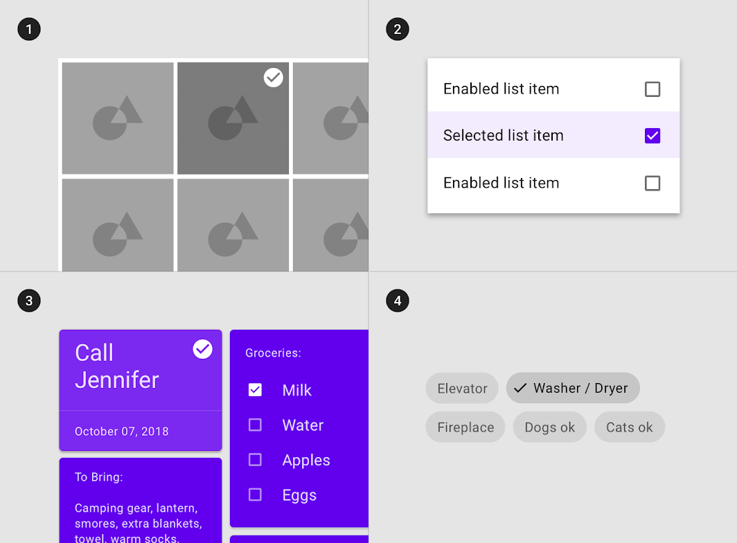
Selected State
This state communicates to the user that they have made a selection from a group of options. Selected states can be applied to a whole container of a component or to elements within depending on circumstances. Common elements that utilize this state are cards, lists, data tables, menus, etc.
Selected states can be combined with hover, focus, pressed, or dragged states where appropriate.
One or many options may be selected depending on the component. There should be clear visual cues as to which options are selected and those that are not.
Selecting an element may enable/hide/reveal other elements on the page when appropriate.

Active State
This state lets the user know which option is currently active. It is common in navigational elements like tabs, to show what choice a user has made, or show a default option.
Active states can be combined with hover, focus, or pressed states where appropriate.
Within a grouping, only one element can have the active state applied at a time.

Pressed State
This state communicates that a user is currently interacting with an element via click, tap on a touch-enabled device, or by other assistive technology.
- This state should only be applied to one element at a time as the user interacts with the page.
- Pressed states can be combined with hover, focus, selected, active, and on/off states where appropriate.
- The system should give some form of visual cue within 400ms of a user taking an action. This indication should inform the user what the status of their action is, whether it be that the system is working on fulfilling their request, or provide the results of that action. (read the section below on the Doherty Threshold for more information).
The pressed state, much more than other states, is visually associated with animations once a user makes an actual choice. The length and complexity of this animation should be relative to its importance in the overall hierarchy on the page. The animation on clicking a check box should be rather fast and short relative to something like a visualization. For more information on animation please visit the Animation/Motion section in Foundations here.

Dragged State
This state lets the user know that the element they have "clicked and dragged" or dragged by touch, is currently being interacted with. Dragging objects is most commonly used to reorder items, or add items to a group or process (like upload). When used with a cursor-enabled device, the cursor should be expected to change form.
- It is common to use certain iconography to give the user a visual cue that an item can be dragged.
- Only one object (or a grouping of selected objects where appropriate) can be dragged at a time.
- For non-cosmetic interactions (not just reordering) you should be prepared to offer an alternate method of interaction to meet accessibility standards. For example on upload, you could drag a file to an area or click a button to enable the user to search their local files. Otherwise you may lock out certain users from this functionality.
On/Off States
On/off states let the user know which option in a grouping is currently selected, where only one option can be selected at a time. Groupings like toggles or switches commonly have these states applied and must have at least one of the available options selected (on), with the first option in the group usually selected by default. Some groupings like radio buttons and check boxes are completely optional, but still only allow for one on state at a time.
Error State
This lets the user know that something about their input has returned an error from the system. For more guidance on error handling, please see the Communication section of Foundations here.
Device Specific Interactions & Gestures
Mobile phones and tablets, as well as some other devices, have brought new ways to interact with digital products. Some of these interactions simply replace interactions that occur with a keyboard and mouse, while others extend these products into the physical world. Because we are not interacting with these products in the traditional sense, either by touching or by using another new method, we need to make sure these interactions are reinforced with sound and haptics to give appropriate feedback. The speed of interaction should match that of the input the user is giving. For instance, if the user does a fast swipe to scroll on the screen, the page should scroll fast and go further than if the user had made a small, slow scroll.
When gestures are available there should be appropriate visual cues to the user that something is interactive. In some cases periodic user onboarding might help with this. Icons and small animations are great affordances to indicate a gesture is available.
Gestures should always align to the user's expectations and be intuitive. Pinching to select something would be weird. Instead stick with its more common user case, zoom.
Touch Gestures
Tap
The tap gesture generally replaces the click function on a mouse. There might be some instances where a double tap, or a press and hold function would also be applicable.
Scroll and Pan
This replaces the scroll function on your mouse or the scroll bar. The main exception here is that the speed of input from the user has much greater range than that of a traditional input method. Horizontal scrolling on mobile devices should be limited to maps and other such visualizations.
Drag
The drag gesture allows the user to move panels and other elements at varied elevations in and out of the viewable area. A long tap can activate this gesture to reorder/add items in a group or function.
Swipe
Swipe allows the user to move between items horizontally. Cards in a carousel are a great example of this.
Slide (Single Axis Drag)
Essentially this is a tap and drag without the need to do a long tap. This would apply to components like sliders.
Pinch
This gesture allows the user to zoom in and out of content where appropriate. Most commonly used with maps.
Device Interactions
Movement
Most mobile phones and tablets have accelerometers and onboard GPS. Some apps have interactions activated by "shaking" a device. Additionally simulated movements the user might perform utilize these functions to mimic real life actions like casting from a fishing rod or tossing an object.
Location
Some interactive elements might utilize the onboard GPS to track movement and trigger actions based on location and travel. A good example of this might be a user physically entering a geofenced area with their mobile device which triggers some sort of notification.
NFC and RFID
Onboard communication sensors allow mobile devices to interact with physical objects in the real world like door locks, payment systems, and package lockers.
Camera
Devices with onboard cameras may provide extra opportunities for interaction by allowing features like OCR (optical character recognition), uploading photos, and augmented reality.
Wearables
Smartwatches and other devices might have an array of sensors that measure everything from heart rate to blood sugar that can trigger actions.
Voice
Smart devices like phones, tablets, and other voice-enabled technology can receive input from users just by them speaking into the device's microphone. This might be as simple as text-to-speech. As complex as spoken commands given via keyword, or for more advanced technologies, artificial intelligence based speech interfaces.